
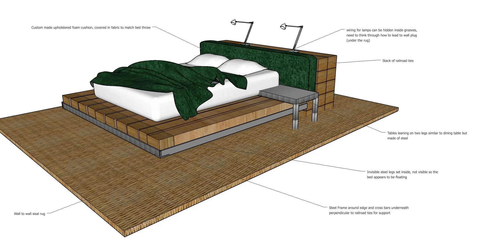
3D Construction Model
Platform bed-chest of drawers-partition wall
People love an en-suite, but you want to avoid a bathroom door that opens directly into the space where you are sleeping. The key that unlocked the solution to this rectangular bedroom with the door to the bathroom on one end was a custom designed bed/headboard/chest of drawers. This one piece solved three different space challenges; it separated the bathroom and dressing activities from the sleeping space, it saved space by using the back of the chest of drawers as the headboard, and it provided a layout that put the window and view front and centre from the bed and away from the bathroom.


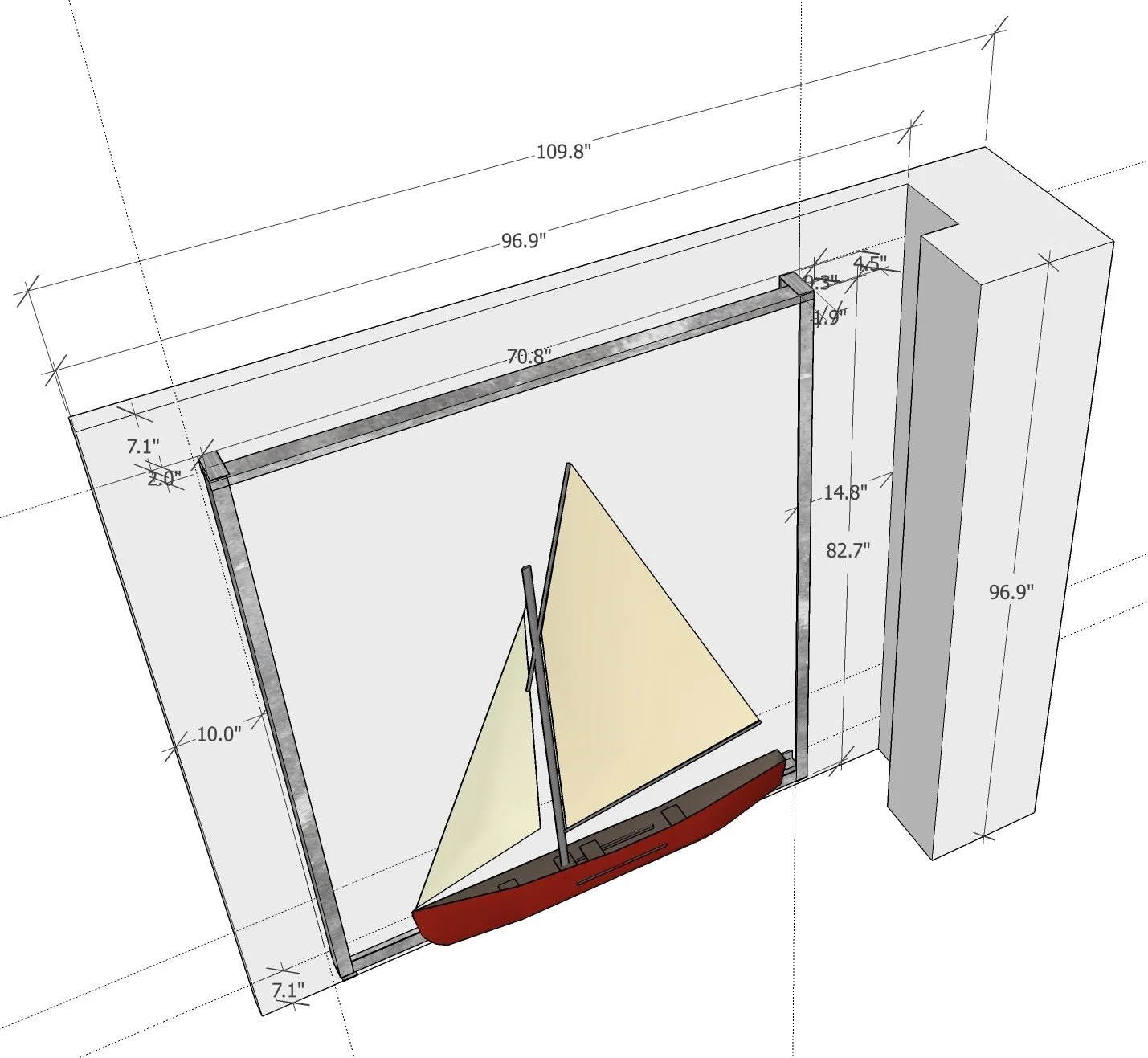
3D Construction Model
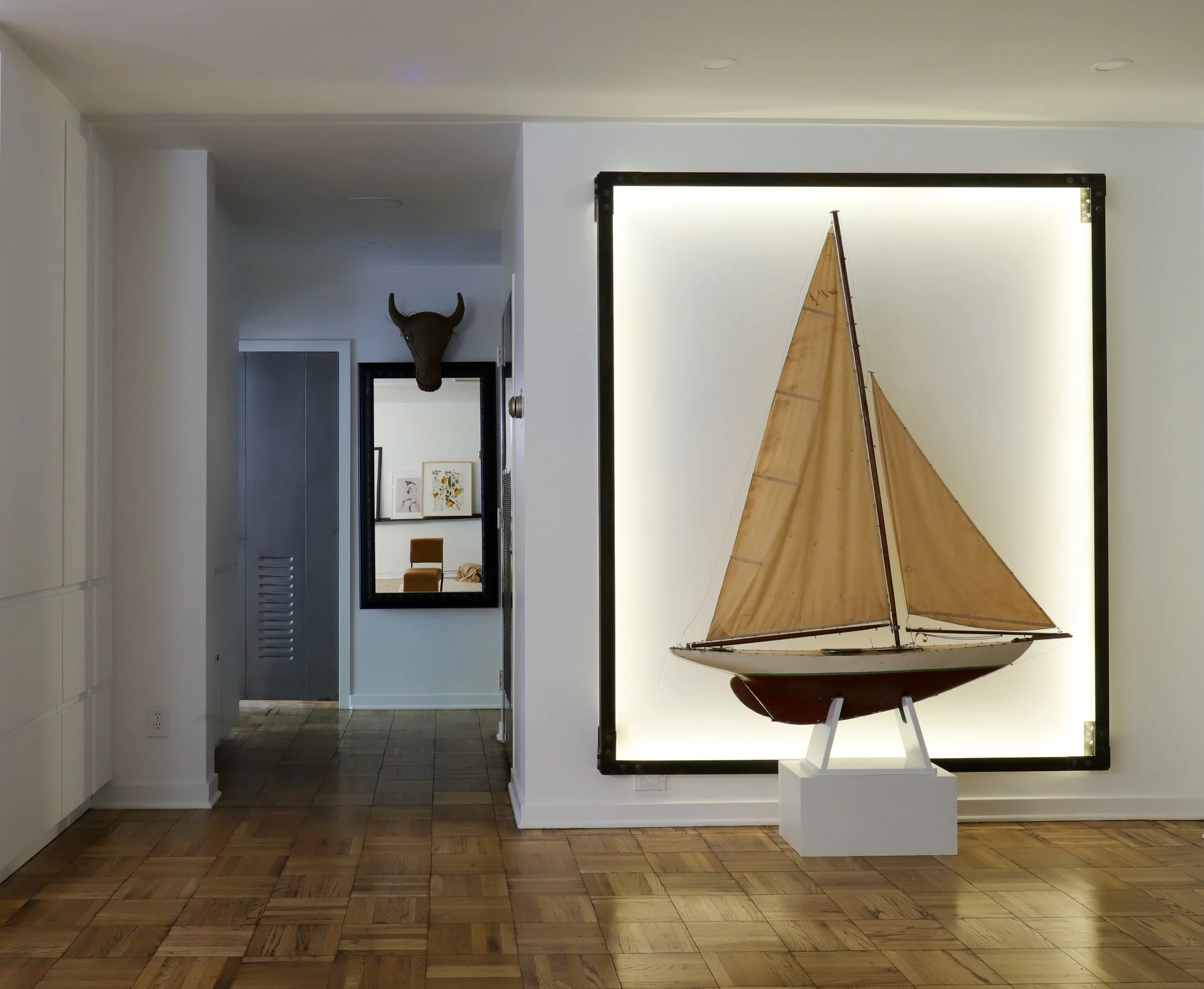
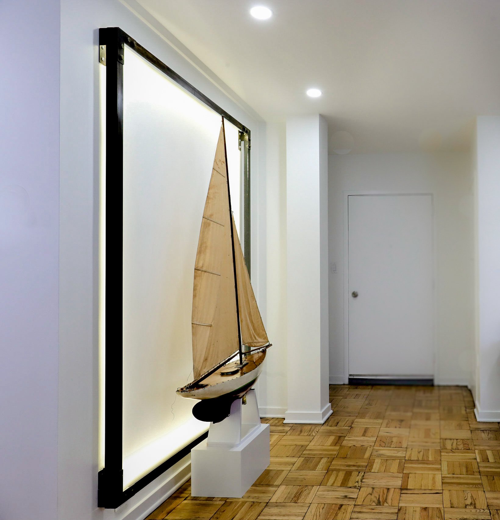
Illuminated steel “picture frame” and lighted entry
The entry to this apartment did not have space above where the door swung open resulting in a dark entry and no opportunity for a decorative light. We designed for this client a lighted ‘frame’ around a family heirloom providing both interest and lighting upon entering. All whilst solving the problem of what to do with the sailboat that was a ‘must have’ in the living space.

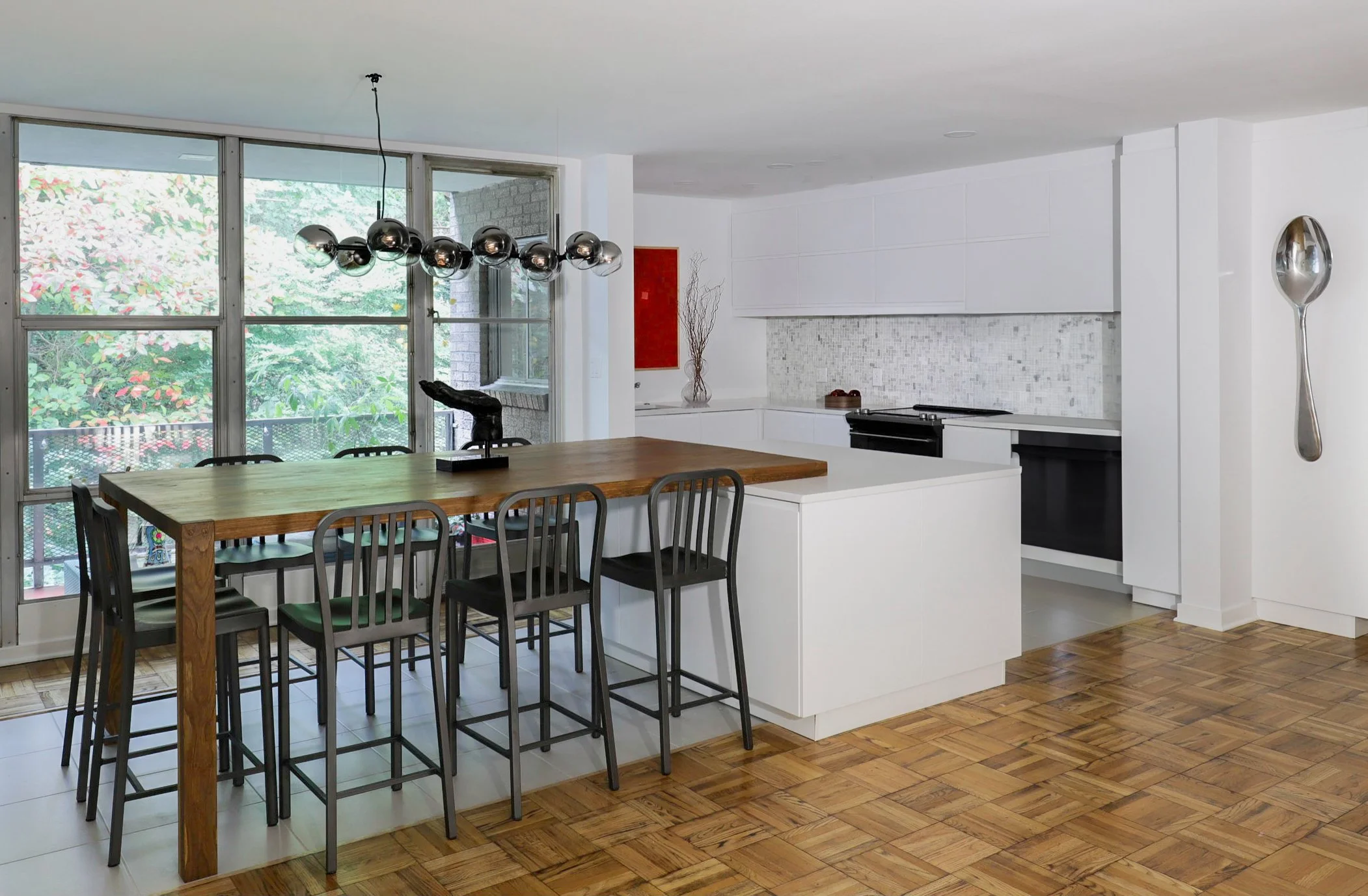
3D Construction Model
3-legged “bistro” table
This table had to be custom made as it was counter height and stood on three legs. Definitely a build-not-buy scenario.
The enclosed kitchen was being converted into an open plan kitchen-diner and we planned for an oversized island that would give enough space for food prep, lots of storage, but unusually, act as the fourth leg to the counter height ‘bistro’ table for energised entertaining.
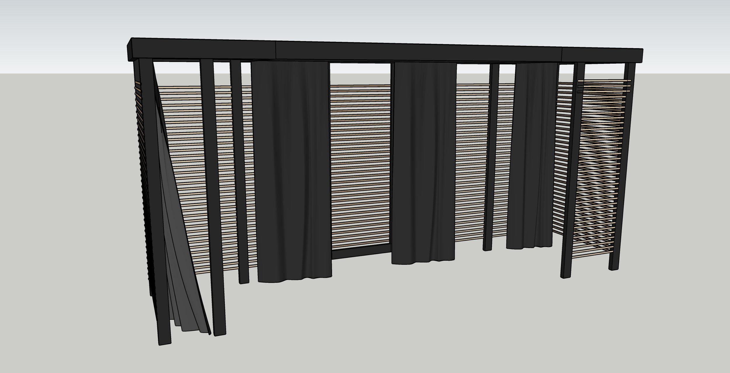
3D Construction Model
Lounger, dining table, side tables, pergola
This back terrace had to serve a multitude of functions for this small family. They wanted a lounge space, a dining space and a work space. This modular lounger - dining bench sitting in the centre of the space was the cornerstone. Tables that were strong enough for dining but that would pack away was essential. The pergola with airy cladding and two types of sheer and solid curtain panels allowed for any type of sun, air, and privacy in a given moment.
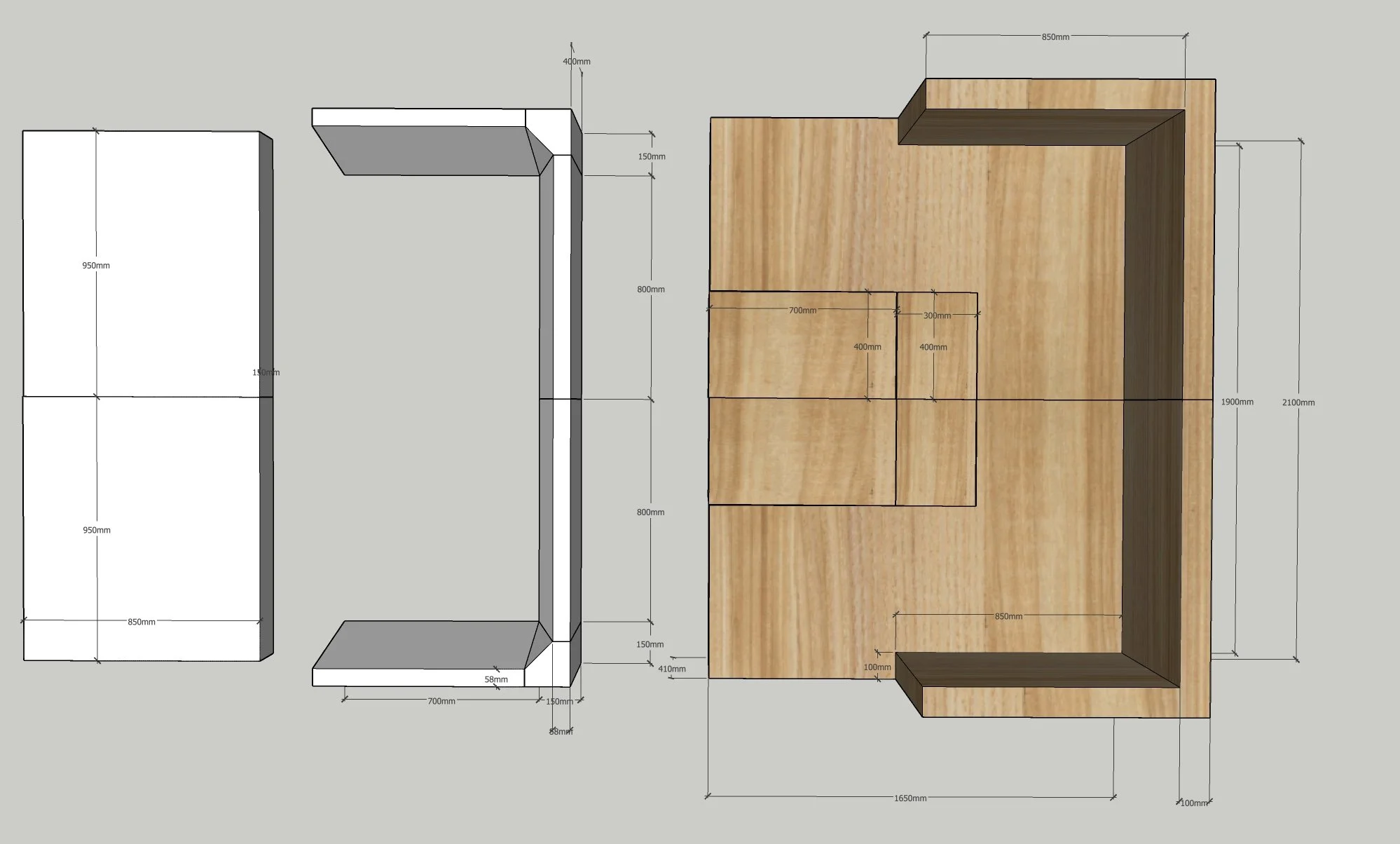
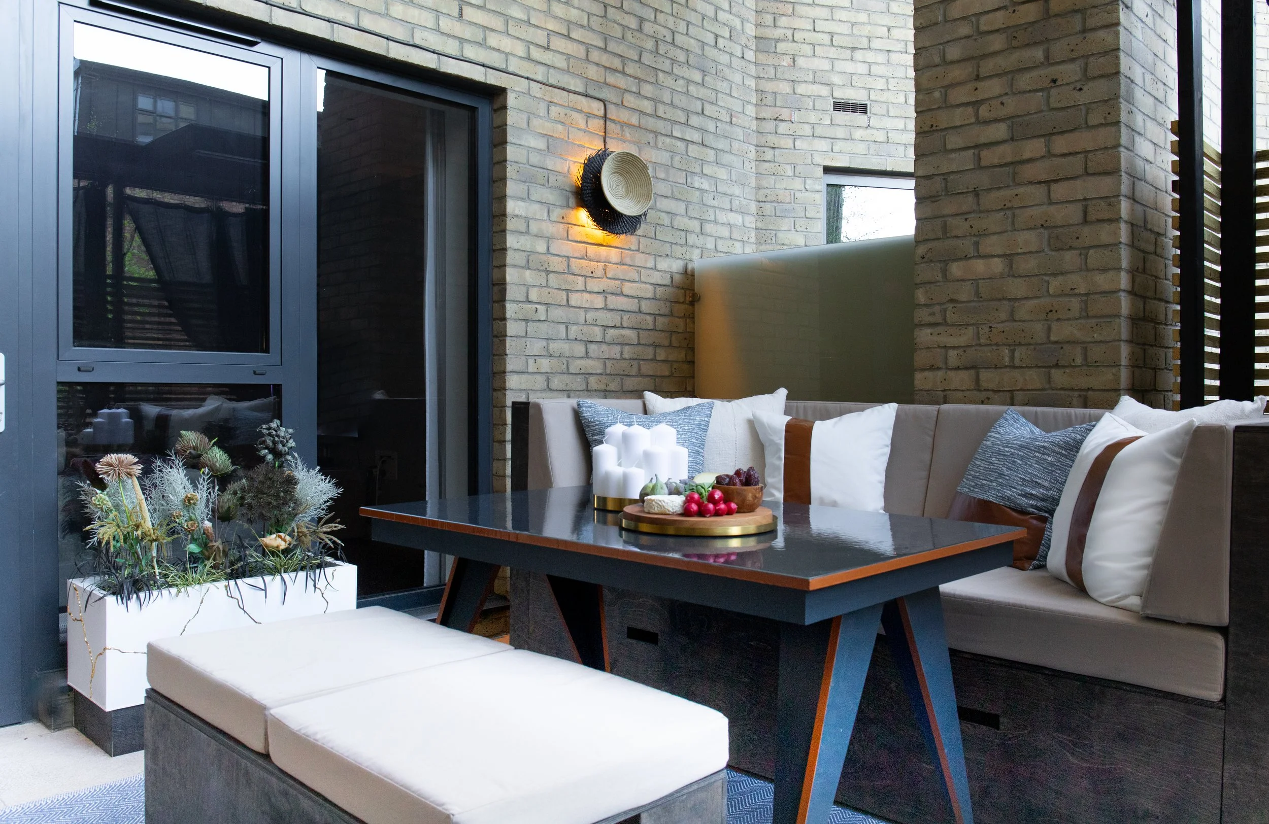
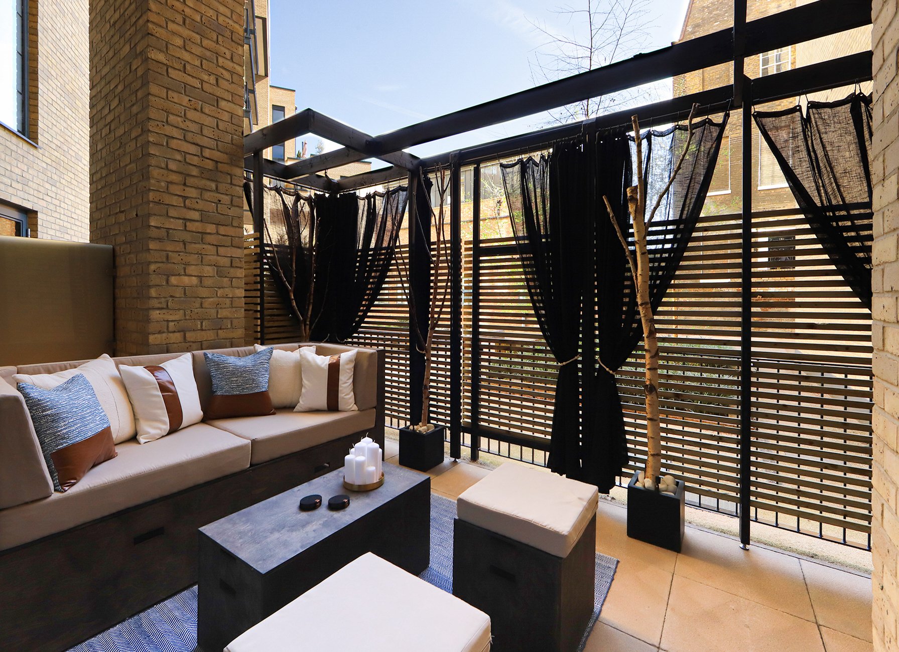
The first image shows the multi-functional unit in a dining or working configuration, the second shows the unit as a lounger.

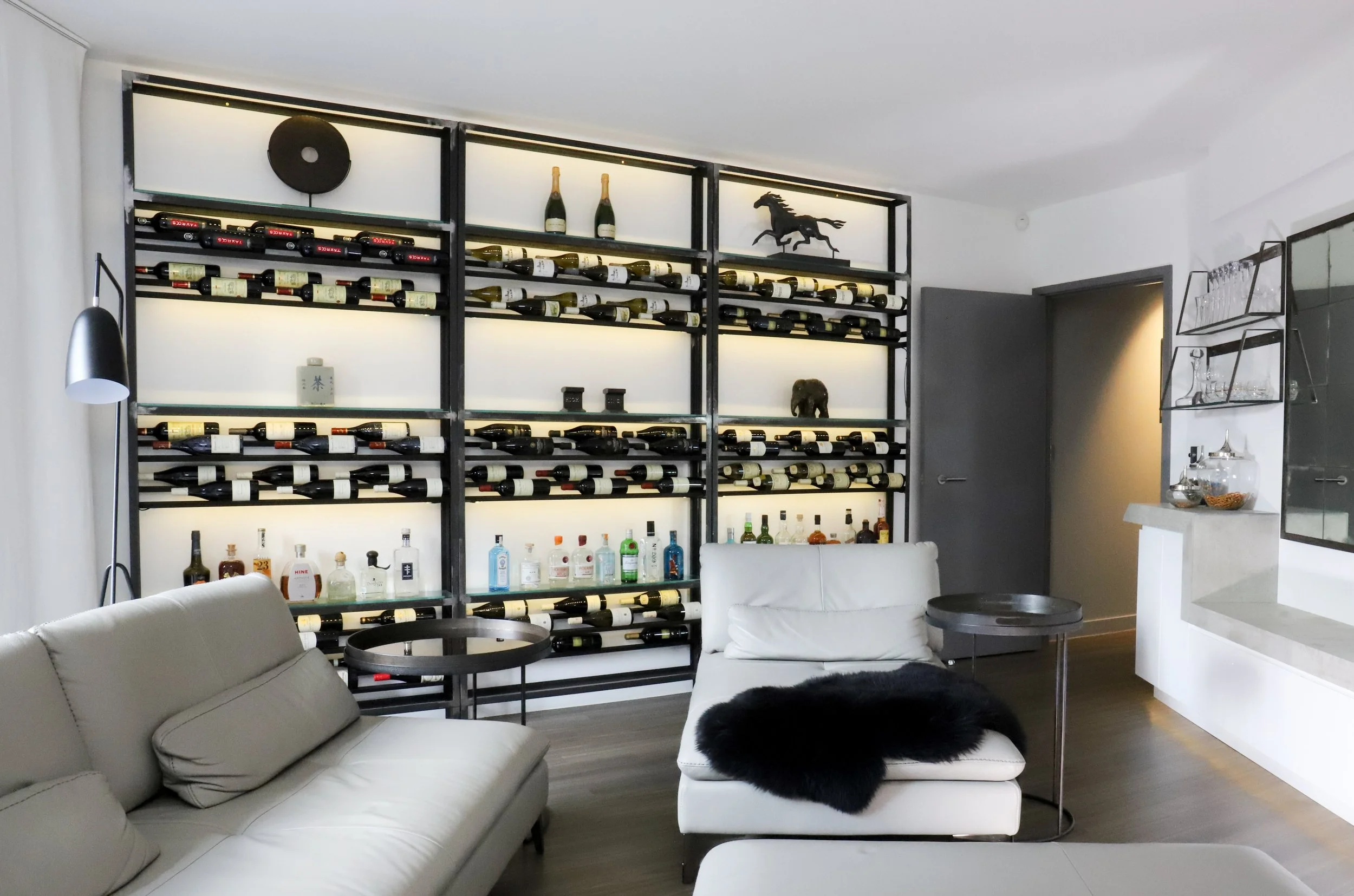
3D Construction Model
Illuminated wine rack
This wine rack was designed and installed in a London flat to solve a storage solution and also to add another layer of mood lighting in the lounge. We brought the dimensioned drawings to a local steel welder and used LED strip lighting once it was in place.
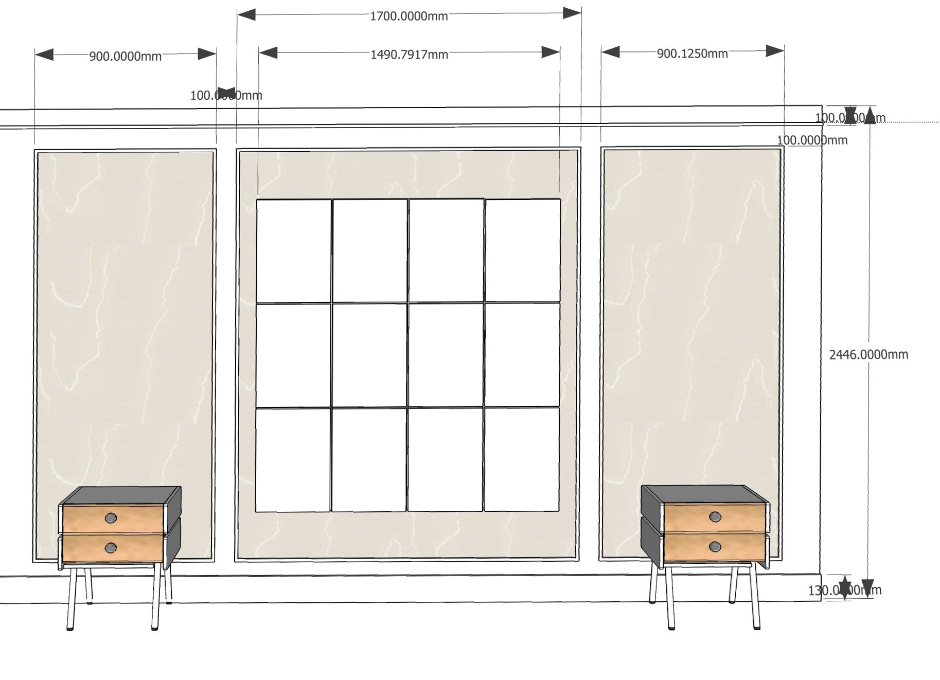
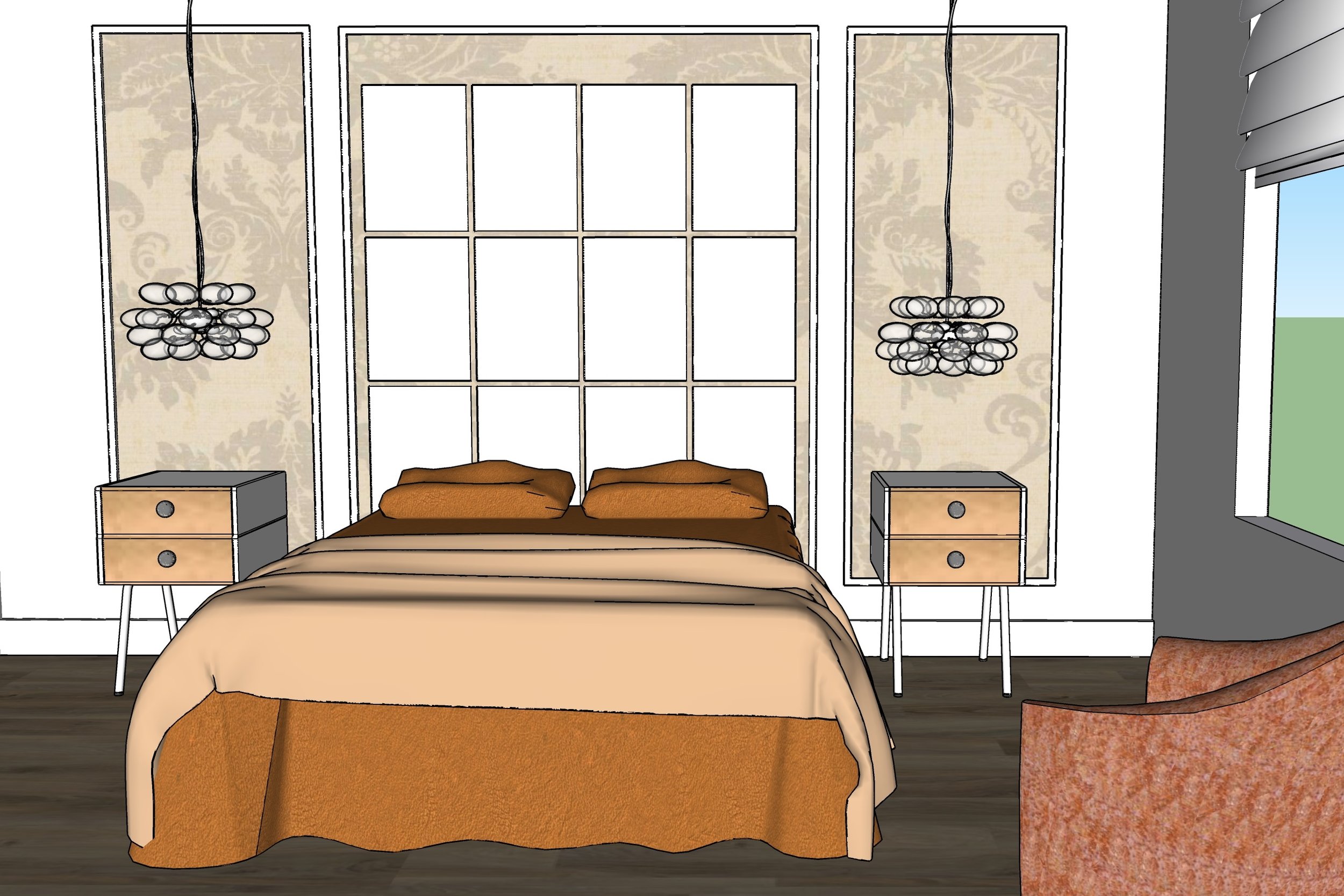
3D Construction & Design Model
Headwall
This is more than a headboard. It is a head wall with trimmed wallpapered panels covering the entire wall topped with mounted upholstered pads, taking up very little space but providing layers and a reflective surface for soft pools of lighting.

before

after
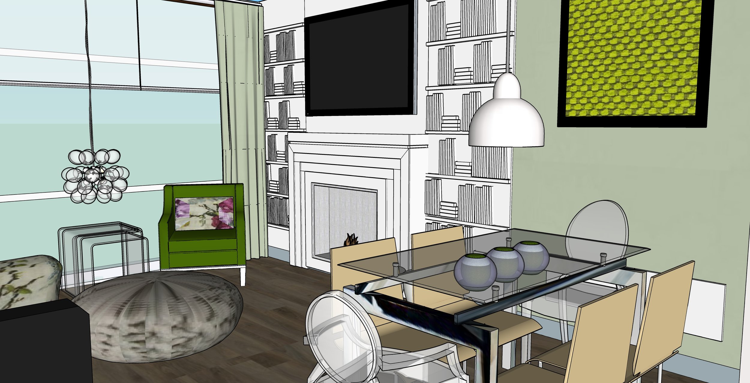
3D Design Model
Wall panel - library
New builds can be white boxes the you move in, but it doesn't have to stay that way. This custom designed wall treatment retains the airy modern feel but is something unexpected. Layers do not have to take up space to add interest.
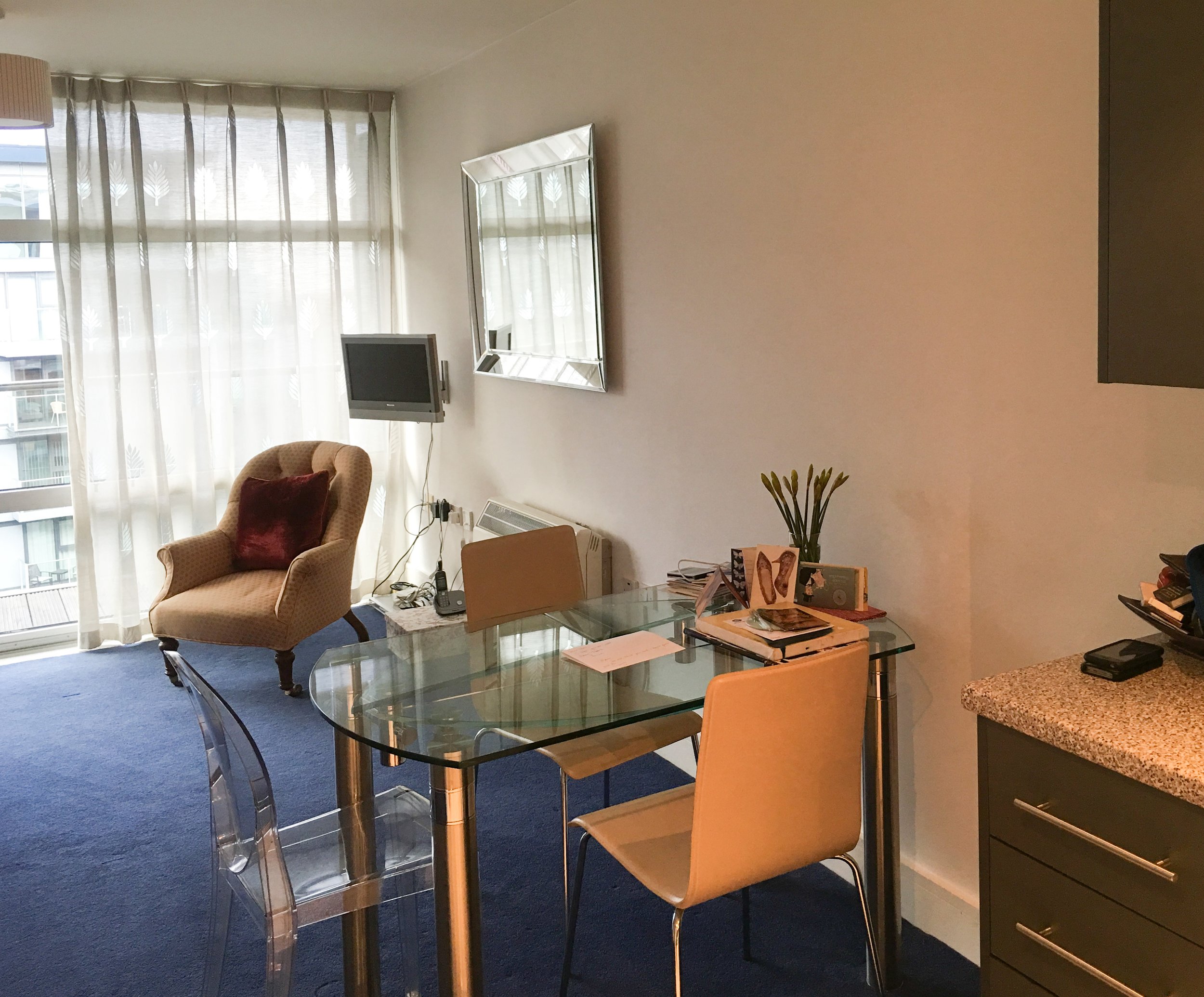
before

after

after